BY STEVE POND
 STORM WARNING: For The Perfect Storm the director wanted a drawing
of the climactic moment when the boat is caught by a 100-foot wave.
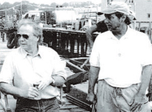
Wolfgang Petersen (left) and William Sandell have collaborated on
four films. (Credits: Warner Bros.)
It starts with the bare minimum: words on a page, ideas in a director's head, visual concepts or an image of what it should look like in the end. As a director with a film in its earliest stages, you might be sitting in a bare office with an assistant, a script in some form, and perhaps a line producer who's come on board to help get things going. But long before the words and concepts and ideas can be realized on the screen, they have to be given a physical reality; before there's a movie, there must be locations, sets, backgrounds. And often as not, one of the earliest calls will go to a production designer.
"To me, a designer is my first collaborator," says Taylor Hackford. "It's amazing what production designers do—the research and the effort and the detail never cease to amaze me," adds Nancy Meyers, the director and writer of Something's Gotta Give and The Holiday. "As a director, you go with the location scout and look at an empty room and say, 'Okay, this can be the newspaper office where the character works.' And then months later you come back and see it, and it's a full-blown newspaper office, down to the clocks on the walls and the papers on every desk. You might have a room full of 45 desks, but if you look closely you'll see that everyone has a life at their desk."
The collaboration between directors and production designers is a critical one, whether the director is like Meyers, who, according to her longtime designer Jon Hutman, comes to each film with definite design ideas and "a strong and concrete sense of the link between her characters' identities and the places they inhabit," or like Wolfgang Petersen (Poseidon, The Perfect Storm), who admits he needs an outsider's talents before he can fully visualize the script. "To me, the production designer is a crucial partner, since it's an area where I need strong help," says Petersen. "I cannot draw—I can only talk a little bit about what I want. So I need the designer to give me something where I can say, 'Okay, I can shoot that.'"
So what are the keys to a good director/designer collaboration? Trust is the word you'll hear most often when you pose the question to successful practitioners from both sides of the equation; also in the mix are confidence, chemistry, communication, flexibility.
"The process is the same, whatever kind of movie you're working on," says John Myhre, who won Academy Awards for art direction on two of director Rob Marshall's movies, Chicago and Memoirs of a Geisha. "You walk through the entire movie, look at the characters and say, 'Who are they? What is their environment going to look like?' You have to break down each element—the look, the sets, the location, the costumes—and say, 'What is the story we're telling with this element?'"
The job, though, can differ from director to director, from film to film and even from scene to scene. There are many ways in which the director and designer interact, a variety of instances in which designers can prove invaluable to the person who hired them. Here are a few examples of the collaborative process, drawn from partnerships between directors and designers who have worked together repeatedly over the years.
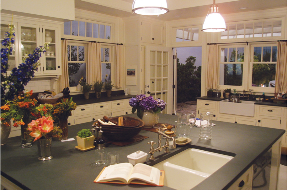
 CHEF'S DELIGHT: Nancy Meyers' longtime designer Jon Hutman says she understands
"the link between her characters identities and the places they inhabit." He modeled
the kitchen in Something's Gotta Give after Meyers' own. (Credit: Sony Pictures)
SETS
In Meyers' films—where, the director admits, "I can spend 40 pages between the kitchen and the living room"—homes are crucial. "Understanding the world of the characters is a way to understand those characters," says Hutman, who has designed three films for Meyers. In Something's Gotta Give, for instance, it was essential to paint Diane Keaton's upper-class lifestyle with just the right strokes: the color palette heavy on whites, the spacious house in the Hamptons.
"Jon can design a great movie house, which is very important for me," says Meyers, who adds that Hutman's sets tend to be just a bit grander than she imagines when she's writing the films. "He adds scope," she says. "The staircases get a little bigger, the halls get a little wider..."
And the kitchens he designs get a little more spectacular. For Something's Gotta Give, Diane Keaton's kitchen was patterned after Meyers' own, but Hutman says he also went to "every house in the Hamptons" and borrowed the best ideas. "And now they still talk about that freakin' kitchen. If I had a nickel for everybody who talks to me about that kitchen...," she says.
Meyers is well aware that Keaton's house still resonates with moviegoers. "That house has had an impact like nothing else I've ever done," she says, laughing. "It's almost aggravating. I was shopping a few days ago, and when I handed the salesgirl my credit card I could see her eyes light up. She said, 'Are you the director of Something's Gotta Give?' I said yeah, expecting she'd say something nice about my work. And instead she said, 'Where did you find that blue rug?'"
LOCATIONS
Rob Marshall and John Myhre have worked together on three films (Chicago, Memoirs of a Geisha and the upcoming musical Nine), and both describe the relationship as intensely collaborative. "Rob loves to have his entire team in meetings, so I'm usually there with [DP] Dion Beebe and [costume designer] Colleen Atwood," he says. "Rob has a saying, 'The best idea wins,' which is a really exciting way to work."
Sometimes, though, Myhre is by himself, as he was for several weeks in Japan scouting locations for Memoirs of a Geisha. At one point, he went to the Fushimi Inari-taisha shrine in Kyoto, where he found thousands of "Torii Gates"—elegant, red wooden gates, closely spaced—snaking up the hillside. "It was inspiring," he says. "They were so dense that the light inside them turned orange. There was nothing in the movie that called for a location like that, but I knew I had to show Rob."
When Marshall arrived in Japan, the designer insisted on making the 45-minute drive in a van full of other staffers who were complaining about the detour. Marshall finally laid down the law: "If John Myhre says we have to go to this place, we're going to this place."
"He was so excited to show me, and he knew I would flip over it," says Marshall. "And I did. It was astounding to see miles and miles of these gates, and there was no question when I saw them that they were going to be in the movie. I just had to go back and figure out how best to use them." In the end, Marshall filmed a striking sequence in which the young heroine Chiyo (Suzuka Ohgo) breathlessly runs down the long passageway (though the shot could only show about 200 of the shrine's 10,000 gates). "The greatest thing about working with John," Marshall says, "is when he presents me with something that I never imagined, something that unlocks a whole new area I can go into."
IMAGES
Preparing to shoot The Perfect Storm, the film based on Sebastian Junger's book about a fishing boat capsized by a monstrous wave in the North Atlantic, Wolfgang Petersen always knew that one shot in the film would have to stand out. "We were always looking ahead to the big climactic moment when the [fishing boat] Andrea Gail has finally been caught by the 100-foot wave," he says. "It goes up the face of the wave and then starts to slip back, and that's the point when you know it's not going to make it."
Everything that came before had to build to that ultimate moment; every storm that the ship encountered earlier in the film had to pale in comparison to the final onslaught. "I knew that it might become a signature image in terms of the trailer and the one-sheet," says Petersen, who enlisted production designer William Sandell to conceptualize the moment. "Right from the start, I asked Bill to give me drawings of what that might look like. It was a key visual idea that was very important to the movie."
Sandell, who had previously worked with Petersen on Outbreak and Air Force One, and would go on to do Poseidon, was accustomed to the director's methods. "He says, 'Show me a lot of things,' and then he leaves the art department to come up with as much as possible," says Sandell. "You've gotta show him the good, the bad and the ugly."
To visualize the ultimate wave, Sandell and his team did extensive research and talked to "every big-wave person ever"—less to be strictly accurate than to get a sense of how far they might be able to push the envelope. "Basically," says Sandell, "we showed him drawings until he said, 'That's it!'" And as Petersen predicted, the image was featured prominently in the trailer and on the one-sheet.
SOLUTIONS
Making Running Scared in Prague, director Wayne Kramer and production designer Toby Corbett had problems. First, budgetary constraints had forced them to shoot in Eastern Europe even though their film was set in New Jersey; Corbett found a few passable exteriors and then built lots of sets, something he hadn't had the luxury to do on the pair's first collaboration, the $2.5 million drama The Cooler.
One set was particularly crucial; it was the apartment occupied by a group of pedophiles, and Kramer wanted it to look strange, almost otherworldly—a menacing environment in which a child finds himself trapped. "I wanted an enclosed feel, a sense of entrapment, but not just bare walls all around him," says Corbett. But cinematographer Jim Whitaker, another key member of the team, needed light to shoot a scene in which the abducted boy hides in the apartment's bathroom. "I didn't want to have a window, which gives a sense of opening and escape," says Corbett. "So I thought, what if one wall of the bathroom was frosted glass? There was underlying fairy tale imagery in the script, and the frosted glass created a fantasy element that was almost hallucinatory."
Realizing that Corbett's suggestion would allow the child to see silhouettes of his captors outside the bathroom, Kramer embraced it. "I loved the idea that you could see the shape of the pedophiles walking down the hallway, and took it a step further," the director says. "What if the shadows were distorted and creature-like? What if we made them look like monsters, like a kid's ideas of what they would be?"
The result was a sequence featuring imagery that Corbett likens to Nosferatu. "That idea would never have come to fruition," says Kramer, "without Toby's cutting-edge thinking about what it could be."
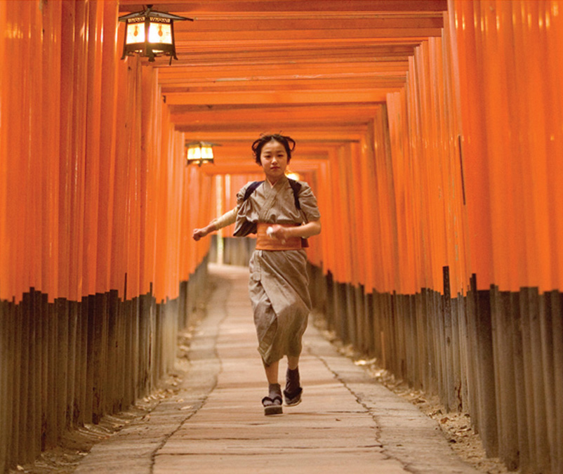
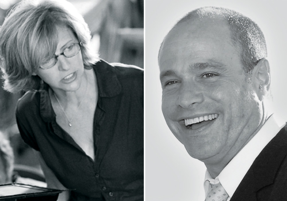
 ON THE RUN: John Myhre (bottom left) has won two Oscars for films he did with
Rob Marshall: Chicago and Memoirs of a Geisha (top). Marshall "flipped" when
Myhre showed him the red wooden gates in Kyoto for Geisha. (Credit: Sony)
INSPIRATIONS
During preproduction on the Taylor Hackford film The Devil's Advocate, a satire in which Al Pacino plays a high-powered New York attorney who also happens to be the devil, production designer Bruno Rubeo showed the director a photo of a pool of water that appeared to be suspended in the air. The pool didn't reflect anything in the script—but for Hackford, it was just the kind of touch he wanted for a rooftop scene on a skyscraper in which Pacino tempts a young lawyer played by Keanu Reeves. Rubeo, who also worked on Bound by Honor and Dolores Claiborne for Hackford, created a spectacular water garden in the sky with the pool seeming to spill over the edges of the building with no separation between water and sky.
"Pacino ended up taking Keanu on a walkway across this pool on the top of a building overlooking Wall Street," says Hackford. "It was the perfect devil-tempting-Christ moment: 'This can all be yours, my friend.'"
His suggestion, says Rubeo, was "just one of the things a director expects from the designer. You're not just there to find locations and build sets, but to input visually into the entire movie."
That input, more often that not, starts at the very beginning of the process. "Usually you get hired first," says Bill Sandell. "The day people like myself show up, set up down the hallway and start going through our books. It's a great moment."
For the director, says Hackford, it's a necessary first step. "You bring the designer in early," he says, "because you really need to work with your ideas. And often, in that collaboration with your designer your vision changes, gets refined and more sophisticated."
The goal, in the best of circumstances, is to sharpen that vision, build sets and find locations that perfectly suit it, and get everything in sync and under control before shooting starts. The reality, of course, can be different; nearly every production designer will admit to dreading what Bill Sandell calls "the worst words you can hear: The director wants you on the set right now."
Sandell still remembers one particular conversation he had with Petersen years ago, when summoned to the set of The Perfect Storm because the second unit had broken the wiper blade on a helicopter.
"I got to the set, saw Wolfgang and said, 'What's up?'
'You notice anything, Bill?'
'I notice you're not shooting.'
'Do you know why we're not shooting?'
'No.'
'Do you see that helicopter?'
'Yes.'
'It's not working.'
'Okay, I'll fix it.'"
Sandell recites the conversation, then laughs. "So I fixed it, and then I staggered across the street to The Smokehouse to have a drink. When you're working on a movie, you don't dare slow the juggernaut down."
So instead, adjustments are made on the fly. Rob Marshall remembers having to junk his original concept for the "Cell Block Tango" number in Chicago, because when it came time to shoot he realized that the neon prison bars he'd ordered "looked like Las Vegas, which was exactly the opposite of what I wanted. John had followed me to the end of the world with that idea of mine, but when I turned to him and said, 'I can't have the neon, it's not going to work,' he said, 'You're right. I know where we can get real bars and swap these out.' I think he went and got the real bars that had been sitting in the alley ever since I decided I wanted neon."
On less expensive films, the pressure can be just as intense, because there's less time in preproduction and often a more hectic schedule. "Working on lower-budget films, the production designer is under tremendous stress," says Wayne Kramer. "We're always shooting, so we don't have time to always check what the designer is doing. So they really have to be in sync with your vision."
Kramer's designer, Toby Corbett, has done his share of last-minute adjustments. "On The Cooler, I had chosen an odd green color, because I wanted a sickly, color-of-money kind of thing," he says. "And Wayne felt it wouldn't work well on camera. I kept the oddness, but I just graded it down a little bit, and it worked great. But we'd just gotten the location a couple of days before, so I needed to do a quick paint job."
Which is not to say that only low-budget filmmakers suffer under budget constraints. Whenever the studio wants to bring down costs on one of his typically big-budget films, says Petersen, they turn to Bill Sandell's art department. "Any time they need to cut a million or two here or there, they go to Bill and beat him up to save money. And he always finds a way to do it."
For Taylor Hackford and Bruno Rubeo, their current project, Love Ranch, is also their lowest-budgeted—but the lack of money didn't stop them from coming up with a distinctive look for what Hackford calls "a moral fable" about a legal brothel in northern Nevada. "We devised a look where the exterior landscape is austere and monochromatic, the flat desert landscape butting up against mountains," he says. "And then when you go inside the brothel, there are no windows and it's like walking into a Fellini movie."
Rubeo, he adds, "got double-wide trailers, because that's how the brothel our film is based on started. And then he found an unbelievable spot by the highway, next to a junkyard. We built our own brothel and put up a sign—and the first day it was up, we had 10 truck drivers stop and ask us if we were open for business."
While fooling randy truckers makes for a good story, it isn't exactly the point of the director/designer relationship. Instead, the goal is simply to create those perfect moments that capture a vision crafted by the director in collaboration with his cast and crew.
"There's no right answer to the puzzle that we production designers solve," says Jon Hutman. "Here's the desk—is it too messy? It is not messy enough? Should I not have used a tall flower arrangement? There's a zillion ideas, a zillion possibilities."
And at least one of those zillion possibilities, the production designer hopes, is the one that will satisfy the person on whom responsibility ultimately rests—the director.
"I believe that you could take any script and give it to six different directors, and if I do my job as a good collaborator, I'll come up with six different versions of the same movie," Hutman says. "It's not my job to come in with the puzzle solved. It's my job to listen, and to help with the director's vision of the movie."