BY SCOTT FOUNDAS
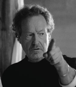 Next year will mark a quarter century since Ridley Scott’s seminal science fiction opus, Blade Runner, first dazzled audiences with its vision of a twenty-first-century Los Angeles choked by neon and drowning in rain, where real human beings are scarcely distinguishable from androids. The story of the “blade runner” follows Deckard (Harrison Ford)–a futuristic Philip Marlowe–and his hunt for four renegade “replicants” led by the psychotic Roy Batty (Rutger Hauer). The film’s vanguard design ranks among the most influential in modern movies, its lipstick traces evident in a wide array of subsequent sci-fi/fantasy successes including The Crow, Dark City and the Matrix trilogy.
But as Scott, who came to Blade Runner having honed his visual imagination in hundreds of television commercials and two striking early features (The Duelists and Alien), is quick to note, the matte paintings, optical printing and in-camera practical effects employed by him and Oscar-nominated visual effects supervisors Doug Trumbull, David Dryer and Richard Yuricich, were downright primitive compared to today’s CGI toolbox. “When you go back 25 years, you’re doing everything by wire and string and people shouting ‘action’ and doing things on cue,” he says. Yet, despite (and in some
ways because of) those limitations, Blade Runner holds up impressively well by contemporary standards.
In Blade Runner’s nail-biting climax, an exhausted Deckard tracks the dying Batty down in a grand, crumbling ’20s apartment building and a desperate game of cat-and-mouse unfolds. In this series of shots, Scott describes how he did it.
Harrison would fire his gun and, a millisecond later, there’d be a second explosion further down on the set. It all had to do with timing, with the floor effects guy and how good his reflexes were. We’re on an anamorphic lens, where the depth of field can be problematic, but I like the quality of anamorphic–the drop-off in focus is very attractive and very filmic. In this shot, from room to room has got to be at least 60 feet, so you’ve really got to understand your emulsion and your meter to get the kind of images we were getting. And [cinematographer] Jordan Cronenweth certainly knew that.
This is a close-up of Deckard’s gun which carries obvious echoes of film noir. Blade Runner was for me a dark comic strip, which I think was fairly unique at the time. I’d been, as a designer, steeped in what I call heavy metal comics–mainly European publications that hadn’t really been seen here. I was very influenced by that and I brought that to bear on what I wanted to do with Blade Runner.
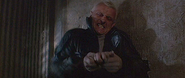
Batty plunges his hand through the plaster and grabs Deckard’s wrist and yanks his whole hand and arm right through the wall and then punishes him by snapping a finger. I think a lot of this influence comes from the Japanese movies–Kurosawa was a master at taking something very simple and making you very squeamish. Like a lot of the shots in this sequence, this one is fairly static, which is a choice. In Alien, you have everything on the move. Here, I was a bit uneasy about steadicams because they were very cumbersome in those days and not nearly as sophisticated in their balance and design as they are now.
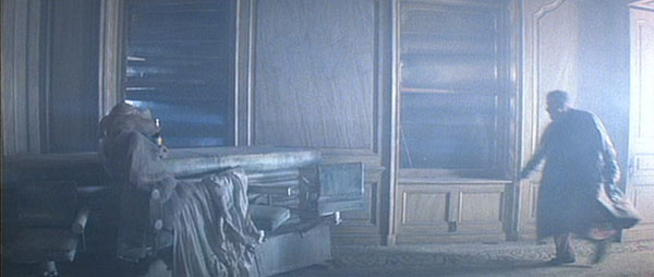
I wanted the apartment to be late-nineteenth-century, just to get away from the modern decay that we’d represented in the city. This is old grandeur, someplace you might have seen in a David Lean movie. And this guy in his overcoat is really right out of a nicely drawn comic strip–a Philip Marlowe comic strip, with the added assistance of the flashing lightning. Maybe lightning is a bit overused, but it works very well here.
You’ve got a lot of air traffic, a lot of spinners, so the buildings are illuminated on all four corners as a precaution. When you’re on the upper floors, like here, the building is constantly being washed by a floodlight, which makes it kind of darkly romantic. A lot of this was the standby work, just ahead of the camera crew. We would be walking around the set and I say, “I want to be here in two hours. Get me some chain link fencing and make me some crude planks, as if this old apartment had been boarded up because it was rotting.”
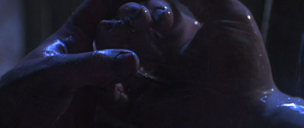
At this moment, Batty is dying, the clock is on and he’s coming to the end of his days, so I thought what would be logical would be a burst of adrenaline through agony. So he takes a nail, which shows his strength, and presses it through the center of his hand. That really pumps him up. I didn’t want to push the Christ analogy too far, though that was absolutely behind the thought. But the agony and the ecstasy of it is actually very practical, because it’s producing gasoline in his veins. He knows he hasn’t got long now.
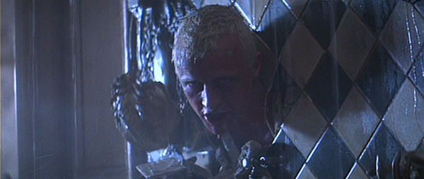
I’d always go sit on the set at lunchtime, by myself, and just stare at the room. It was like going into the Zen zone of ‘How can I push the envelope on this sequence so that it becomes graphically disturbing?’ Then I thought, ‘I want Rutger to push his head through the wall here.’ Salvador Dali did a film, Un Chien Andalou, in which he cut the eyeball of a sheep, and I’ll never forget that–it was so shocking. You think it’s the eyeball of a person. That’s so powerful and so horrific, and yet it’s quite simple.
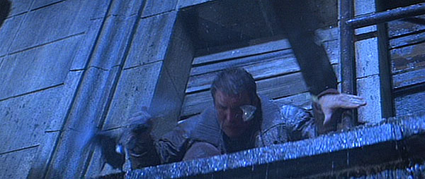
We were outside on the backlot, with this beautiful huge cornice which we’d modeled from a downtown L.A. building, and which we’d enlarged upon. It was in keeping with the grandeur of those ’20s and ’30s pieces of architecture. The trick here was to try and make it look very very tall, to know we were at the top and get a sense of vertigo without getting too involved in matte paintings looking down, because while matte paintings were as good as they could be, it was a bit dodgy to have someone waving his body around in front of a matte.
Deckard decides to climb, and you can see on the left you’ve got this neon TDK sign. I remember thinking it didn’t look tall enough, so we laid mirrorlon on the floor and pushed it beneath the letter “T,” which in turn doubled it up and reversed it. So right there I saved myself doing a matte shot. Light flares also help. It’s something I discovered from commercials, and for the most part, people weren’t doing it in movies at the time.
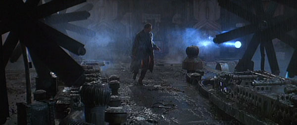
Just as I love flares, I love fans and propellers. We came to the roof and it was dead. The visual was dead. I said, ‘I want something like spinning wheels on top of the roof to give it some movement.’ The art department said, ‘Why would spinning wheels be on the roof?’ I said, ‘Maybe they’re cooling conditioners.’ They said, ‘Cooling conditioners aren’t like that.’ I said, ‘I don’t give a shit.’ So, on the spot, we made up some hardboard pieces and gaffer-taped film cans on the end of them, sprayed the whole bloody lot black and stood them up. They were pushed by the crew before we shot, and the roof came alive.
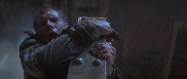
When Deckard jumps across that gap, he lands between two of these beams that are sticking out, and I was always worried that he would land on his chest against the beam. I wouldn’t allow Harrison to do it, so the stuntman, Gary Combs, who was quite a good double for Harrison, did it. What you see behind him isn’t a matte, but rather the façade of the building he’s just jumped from.
This is Batty slowly emerging from behind a tank. One thinks one is being influenced by films from the past, and I think you are. Everyone is influenced by everything that you see, or you should be. There’s a lot of German expressionist cinema in this shot–the shadows, the dramatic low angle. Fritz Lang has seeped in here a lot.
I think a lot of people missed the point of this shot: If Deckard had said, ‘Please don’t let me fall,’ Batty probably would have stomped on his hand. But it’s Deckard’s defiance that impresses Batty, so in a flash he grabs Deckard’s hand and stops him from falling. For this scene, we had Harrison hanging on a cable. But I think we may have managed to do a bit of cable removal. You spray it black, or sometimes you mottle it so that it’s black and silver, until you find that for the speed of the shot it’s mostly not there.
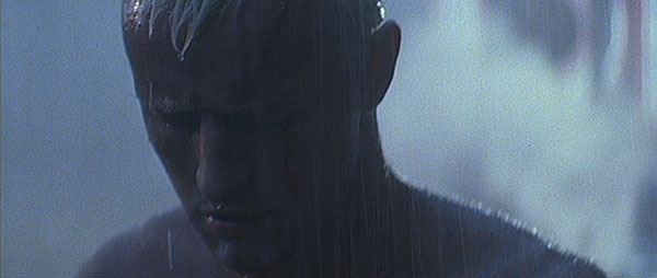
Rutger, I would say, had one of the most beautiful and poetic dying scenes I’ve ever seen, in the sense that he also wrote the words. At 1 a.m., someone said, ‘Rutger wants to see you,’ so I jogged over to his trailer and he gave me this stanza, which I thought was absolutely magnificent. ‘I have seen things you people wouldn’t believe,’ and so forth. He’s holding a pigeon which is a peace image. Then it flies away and Rutger’s head drops, and that’s when we go into slow-motion, which we did in post.